
Award Worthy Logo
The Ferazzoli’s logo takes a simple visual idea and executes it with a lot of intelligence and restraint. At its core, the mark is built around a vertical fork, with two pieces of ziti placed horizontally at the tip, forming a subtle but unmistakable “F.” It’s clever without being gimmicky — the kind of detail you notice, appreciate, and then trust.
Stylistically, the logo feels rooted in early European and French poster design, particularly the turn-of-the-century era when illustration, typography, and composition carried as much personality as they did purpose. The hand-drawn, almost hand-painted quality gives the mark warmth and texture, helping it avoid the overly polished look that so many modern restaurant logos fall into.
What works especially well is how the concept supports the brand story. The fork and pasta reference the cuisine directly, but the execution elevates it beyond a literal food symbol. It feels crafted, intentional, and confident — more like a classic restaurant mark than a trend-driven logo.
Overall, the Ferazzoli’s logo succeeds by combining concept, heritage, and visual character into a single, memorable mark. It’s distinctive, flexible, and designed with a clear understanding of both tradition and longevity.
Erotic Martini Glass Illustration
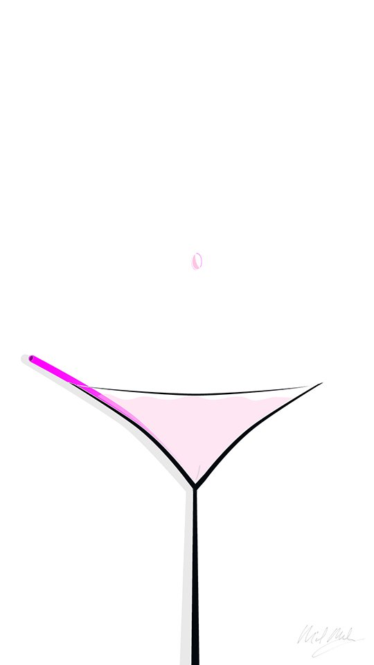
Simple. Subtle. Erotic without being crass or overt.
Graphic Design Spotlight:
Warm Heart Pediatrics Logo Design
An inspired, simple design that appeals to both children and adults. The perfect combination of whimsy and professionalism.

Warm Heart Pediatrics Branding, design by Michael Maloney of Brand Force 5
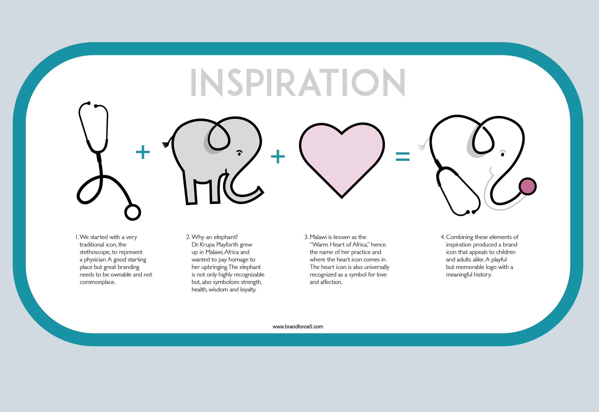
The inspiration of how the icon was created, a fascinating glimpse into the creative process that went into its development. This simple graphic delves deep into the thought-provoking idea and concept that influenced every aspect of the design. From the initial spark of inspiration to the meticulous detailing of each element.
“I love this design and the thoughtfulness that went into making it! Putting the doctor’s heritage in, and making it appropriately playful for a pediatrician, definitely makes it one of my favorites and proves how well the agency listened to their client!”


